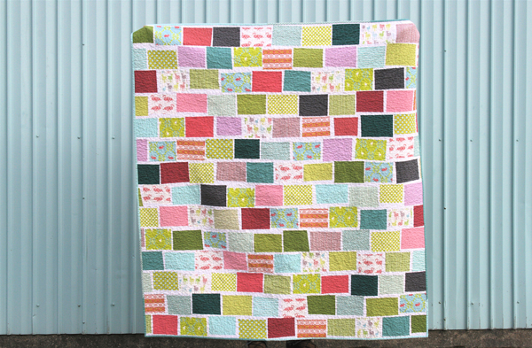
Another favorite!
This one’s been done for quite some time, and in fact has been living with Laurie for several weeks now. It was hard to give this one up, though I’m happy because I think I can say that she loves it just as much as I do.
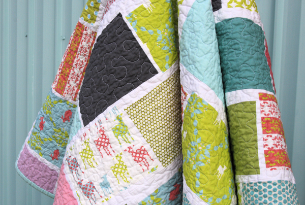
Remember these fun fabrics? They’re part of Laurie’s new Modern Whimsy line – so perfectly spring-y, especially in the Park colorway, which is shown here.
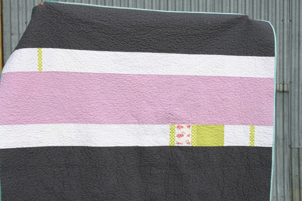
The design for this quilt was actually inspired by a pillow I saw several months ago in a Crate & Barrel catalog. I was immediately drawn to the simple rectangle shapes, made extra special by the way they were all angled differently. I thought something similar would be just perfect to show off Laurie’s designs.
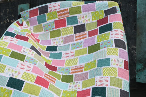
I really love the slight wonky aspect of this quilt. It has a bit of a brick pattern, but the addition of the thin white and the wonkiness really makes me happy. The blocks on the C&B inspiration pillow are appliqued, which I knew I did not want (trust me when I tell you that applique is not my forte!), so instead I added thin strips of white to the blocks and then added the wonkiness when I trimmed them down to size. I’m very happy with the final pieced look, even though it took some time to get it all right!
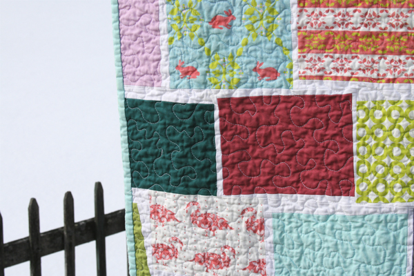
The backing is primarily Kona Coal, with a little extra purple and a couple tiny scraps of Laurie’s fabrics I had left over. The binding is pieced out of a few of the turquoise solids and prints I had left.
Laurie’s shop is currently on vacation mode, but she’s due back soon in case you want to order any of these fabrics. In light of the recent fading experienced with one of Heather Ross’s fabrics printed by Spoonflower, a few of you have asked me what I’ve experienced with Laurie’s fabrics. I’ve made two quilts with her fabrics now and I’ve washed each of them only once before mailing them off to her. I did experience some slight fading, but it was in line with what I expected to see. Based on the way the fabrics are printed, I knew that they wouldn’t wash and wear in the same way I’m used to with commercially produced fabrics. In my mind, I’m ok with a little fading if it means I can get some fabulously unique fabrics like these. It is something to consider though, and if you’re interested, there’s a great thread about this fading issue, including some information straight from Stephen and Kim at Spoonflower about the printing process and what to expect in terms of fading.
Speaking of Laurie and her unique fabrics… you might recall that she had a line picked up by Robert Kaufman called Tufted Tweets and it will be out this Spring. Laurie’s posted the first photos of the new line over on her blog, and can I just say WOW! I’ve been waiting to see the line, and it certainly did not disappoint!
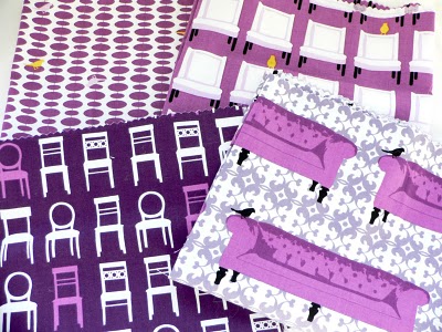
(photo by Laurie Wisbrun)
That orchid… all mine! I’m picturing not only one or more purple quilts, but also curtains, pillows, and I’ll probably have to copy Laurie’s idea for some PJ pants! I’m anxiously patiently waiting until I can see it in person!
 what to do when you love a quilt?
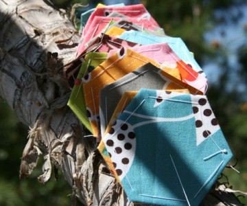 flea market fancy hexagon giveaway


Pingback: pull up a chair… for the stacked seating quilt – Film in the Fridge
Pingback: make lemons | 627handworks