It seems that most of the quilts I make include at least a little pink and almost always some type of floral fabric, and thus tend to be on the girlier side. A lot of that must be due to the fact that I like florals and pinks, but some of it has to do with the fact that I’m not always able to find boyish prints I like.
I was really happy to see that the new organic line, Monaco, by Jennifer Moore of Monaluna has a number of really great boyish prints (ah, those scooters!). I like these prints because they lend themselves well for a baby boy quilt, but would also be perfect for a gender neutral quilt.
I decided to go with my original Spotted Squares design (done previously here and here), because I love how it shows off a good portion of the prints. Since I was using fat quarters of each of the prints, I went with 9″ squares, which results in a pretty perfect baby quilt size (about 43″ x 51″ or so).
And now I just have to pick and purchase a backing… I love the scooters, but I also think the turquoise double dot print would make a nice backing – what do you all think?


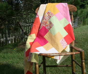
summer sherbet quilt top
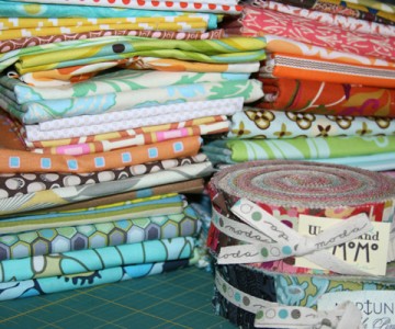
a little destash


I like the scooter print as well. Any backing you decide upon I am sure will be a good fit for this quilt. Maybe it could be backed in white but the stitches could make the outline of a scooter. Carolina
So cute! I bought the scooters and orange bursts after you posted the link here a few weeks ago. I love your design, those squares-in-squares quilts are the best.
I don’t know about the backing but the stripes would make a cute binding!
I definitely agree with you…cute boy fabrics are a rare find. This quilt is very cute! For the backing, I would probably choose the turquoise because I tend to be partial to dots and double dots sounds even better:) Both fabrics are very cute options though.
wowzers, quilted goodness!
you are one crafty lady miss!
i envy your skills! x
I think a nice chocolate brown solid would look great with a large stripe of the scooters or the turquoise dots or both. the turquoise dots might make an interesting binding too..
Good idea! I was thinking of a solid brown for the binding, but maybe it would be better as a backing… thanks for the idea!
I would go with the scooter fabric.
Love the top!
For a fabulous modern design, with so much white on top, you can get away with a bold print on the back. I say go for the scooters. Or the birds (if those are birds.) Or the stripes–oh the stripes are dreamy. Gorgeous quilt.
Love, love, love it!!!
I really like this. It’s cute. I would like the scooters on the back.
Scooters! Definitely the Scooters!
That’s so fun! I try not to put too much white on the back of baby quilts myself (they so often end up on the floor)…I’m partial to the brown ‘cheerios’ print for the back (since you asked!).
I love that fabric line too! I think scooters or dots would be cute but I’m partial to the dots. It’s such a bright and fun fabric!
I do find it difficult to do boy quilts for much the same reasons! Love this line! I think the scooters would look so cute on the back… with the stripe for the binding?
I love those scooters SOOO much!
I like any of the dot fabrics for the backing and binding.
I love this line!! You chose a great pattern to showcase the prints! For the backing I would go with the turquoise since the front has a lot of white, but I’d throw in a stripe or two of the orange as well! I’m sure whatever you end up doing will look fabulous!
LOVE your quilt and how you used this fabric. I just made a receiving blanket out of the blue scooters and the coordinating stripe. It was a dream to work with!
Super cute boy quilt! I really like this line too. I like that double dot, maybe that with 1 line of scooters pieced in – the scooters are so cool.
I love the line and the quilt! I was also drawn to the scooters, but my FAV backing for baby quilts is MINKY!
The orange print really pops out. I think it would be a good backing, but maybe not for a quilt intended for a boy…so I guess I would go with the scooters. Too cute!
Looks great. Love the orange accents.
Do you know what I like about this quilt? – that you didn’t alternate ever other white inside/white outside square in a checkerboard pattern. (Did that make any sense at all?) Anyhow, I’m not sure it would have occured to me to do that and I love it.
p.s. I miss your old header.
I think what Amanda said about the chocolate brown with a bit of the scooter fabric would be perfect. Maybe bind it with the turquoise double dots, although maybe that’s too much turquoise for the front. It would look good with the back though. I’m sure whatever you decide will be great! Always is!
i think the strips would make a great backing, esp for a boy!
I love this quilt top and the fabric is perfect! If it were me, I would do the turquoise double dot print on the back with one of the off centered squares from the front done in the scooters. I would place the square slightly off centered from the middle.
I can’t wait to see what you decide. I hope you repost with a picture for us all to see!
I love the color scheme, I love the balance, I love it!!!
What a lovely, crisp, clean flimsy – looking forward to seeing how you quilt it.
So pretty, I love the fabrics. The patterns make a great baby boy quilt.
Since you’re going for a “boy quilt”, I’d go with the scooters on the back. Some Moms/Grandmoms — your customers — might not go for turquoise on the back. Chocolate brown binding!!!!
I always love seeing one of your new quilts. It is beautiful as always! One thing I also look forward to is the place that you choose to photograph your quilts. To me, that is just as interesting and exciting!
I vote scooters! Such a cute fabric!
So love the scooter fabric. The colours all work so well together but the scooters are my favourite. I love your site and have been featuring you on my blog (annabelleserendipity.blogspot.com) ever since I began crafting and blogging. You really inspire me! Thanks.
Go with the scooters because one there isn’t enough scooter fabric out there and two there isn’t enough fun boy fabric out there. I love the quilt and the big squares so you can show off the print. What a great idea.
I’m all about dots in any form….that’s my input! I love the quilt- so cute!
Oh my goodness. I LOVE this quilt. You have an amazing eye for fun fabrics and designs.
As always, your color choice is perfection! Love it!
Your work has certainly had a wonderful impact on my quilting……but….I have seen sooooooomany quilts being held up after they are all done. Please consider showing us how you get there….the process? http://r0ssie.blogspot.com/2010/05/process-pledge.html
Pingback: FITF: monaco, baby! | Film in the Fridge