As named because why yes, I do love these triangles!
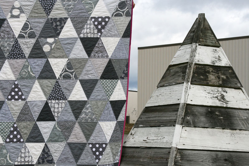
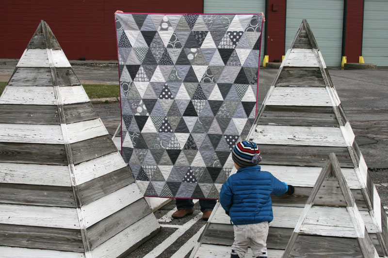
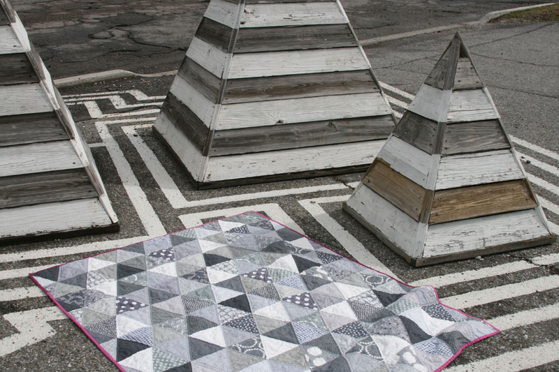
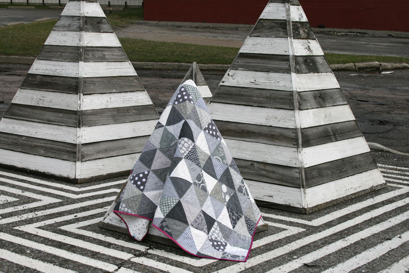
This quilt is completely inspired by this quilt I pinned many months ago. I collected gray fabrics for a while, unsure of what pattern to use, and in the end I decided simple was better. But rather than patchwork squares, I decided to switch it up a bit by going with triangles – a bit harder to piece, but always a fun design.
After my last post, I thought I’d try to redeem myself with some better quilt photos. We had come across these fun wooden pyramids a while back and this spot immediately went on my list as a ‘someday quilt photo location’. How fun to realize that I had the perfect quilt to photograph there!
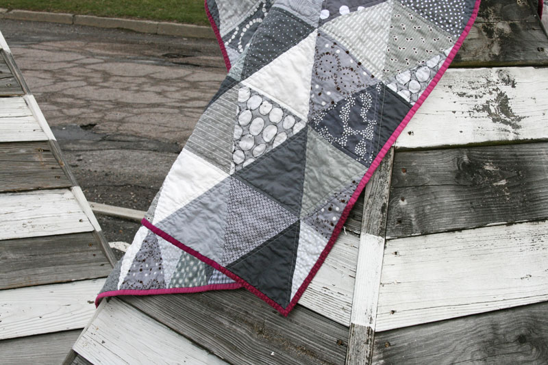
I kept the quilting simple, with straight lines on either side of each seam. I always like the way it looks, and I love those little stars that are created where the points meet (I’d show you a photo, but oops, I forgot to get one!)
I auditioned many solids for the binding, and loved this plum color the best. There are two Michael Miller Cotton Couture solids in jewel and orchid as well as a little bit of a similarly colored Lizzy House jewel print. I kind of liked the idea of making up the binding in shades of plum, just as the quilt was made up of shades of gray (maybe that’s over-thinking it?) Anyway…
I originally thought I might make the backing out of some fun solid or print, but after finding a nice gray and white polka dot print in my stash (you can see a little peek of it in the photo above), and discovering that I had just the right amount, I decided it was meant to be. And I’m so glad it worked out that way, because I love that the majority of the quilt is made up of just gray and white with only that little bit of color in the binding.

 4 (of) hearts – an umbrella prints improv quilt
 farfalle… again!



Pingback: FITF: farfalle… again! | Film in the Fridge